SELECT
COLOR
Client: FreshOn.in
Project: Stationary
Project time: 2 days
The Challenge
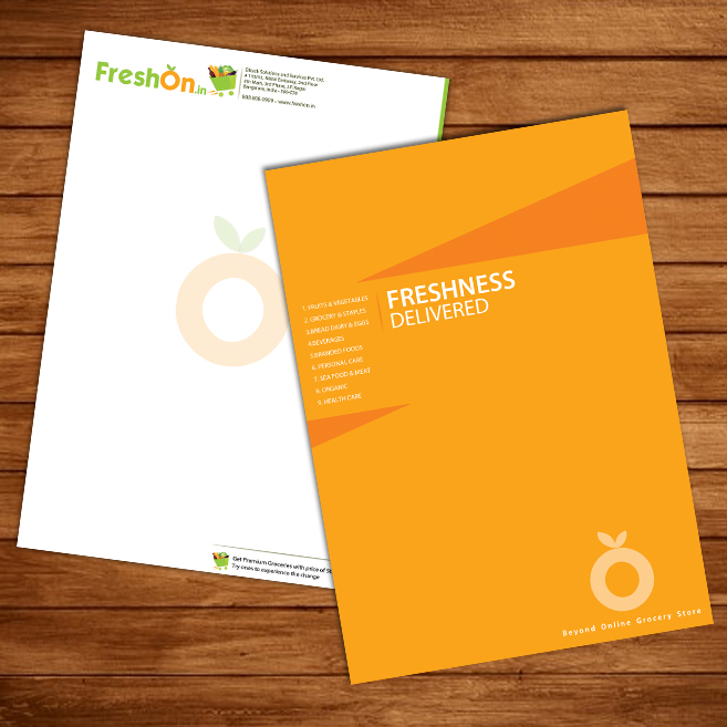
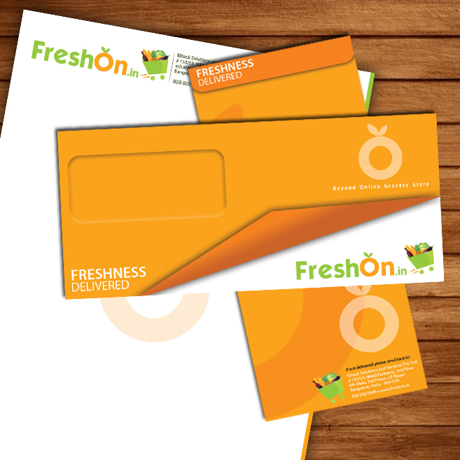
FreshOn was supposed to be competing along with top grocery stores which also provide home delivery. They needed a new secondary logo and also stationary.
What we did
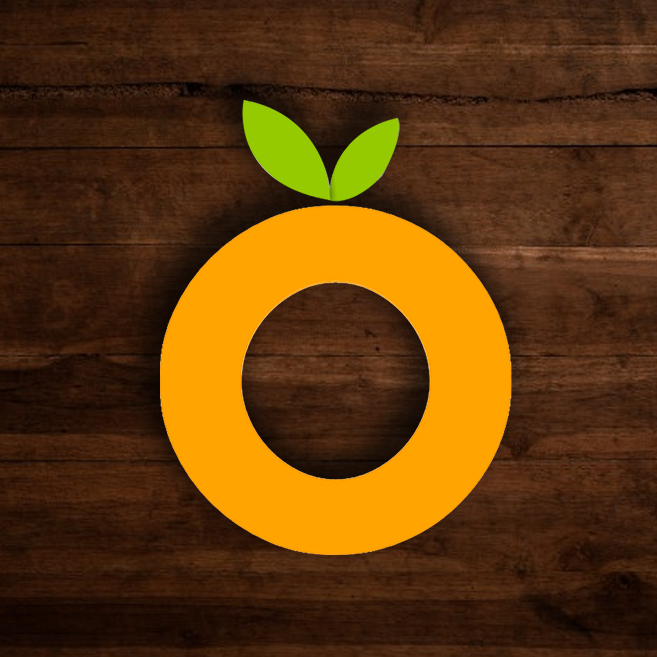
Keeping the brand colors in mind we created a cute looking secondary logo using the "O" and made it look like an orange. We also created the stationary keeping the new color scheme and voice tone of the brand.


